Young Origin is a children’s streetwear brand built around a simple idea: that young people from the streets are worth investing in. The tagline “Conquer the Streets” says it plainly. Behind the clothing is a mission to inspire young people and give them something to belong to.
Streetwear doesn’t forgive brands that don’t belong. Audiences are sharp and the margin for inauthenticity is thin. Young Origin needed an identity that felt like it came from the streets rather than one looking in at them, and that could carry a social mission without softening the edge that gives the category its credibility.
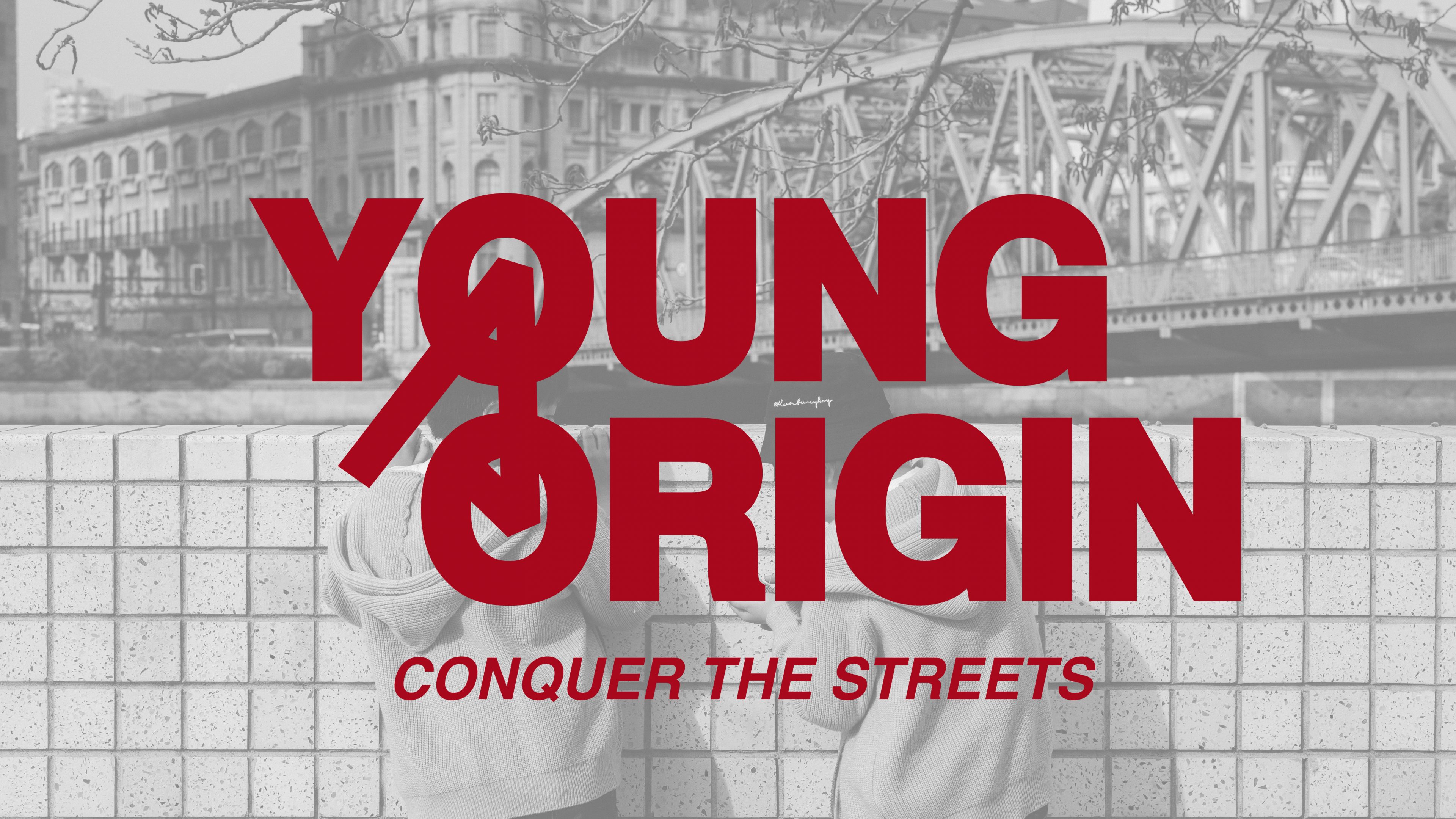
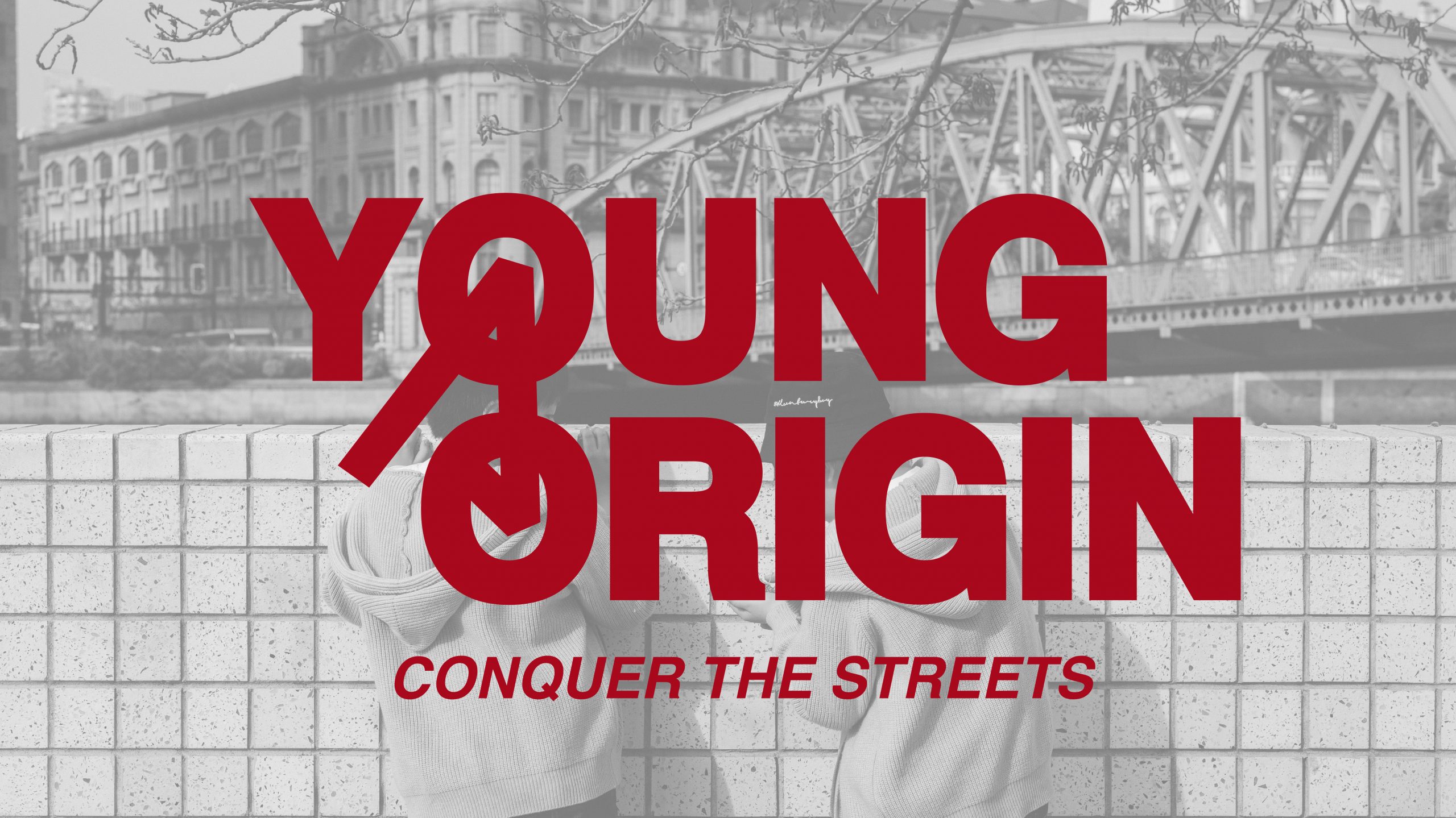
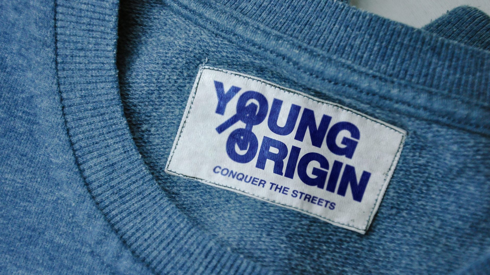
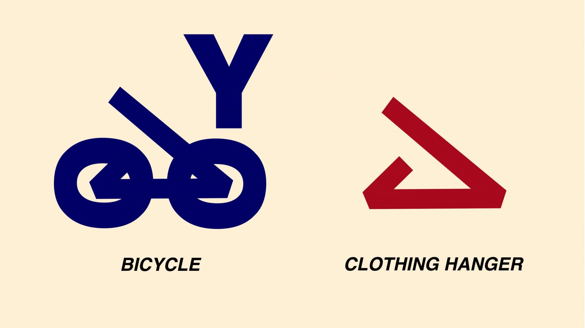
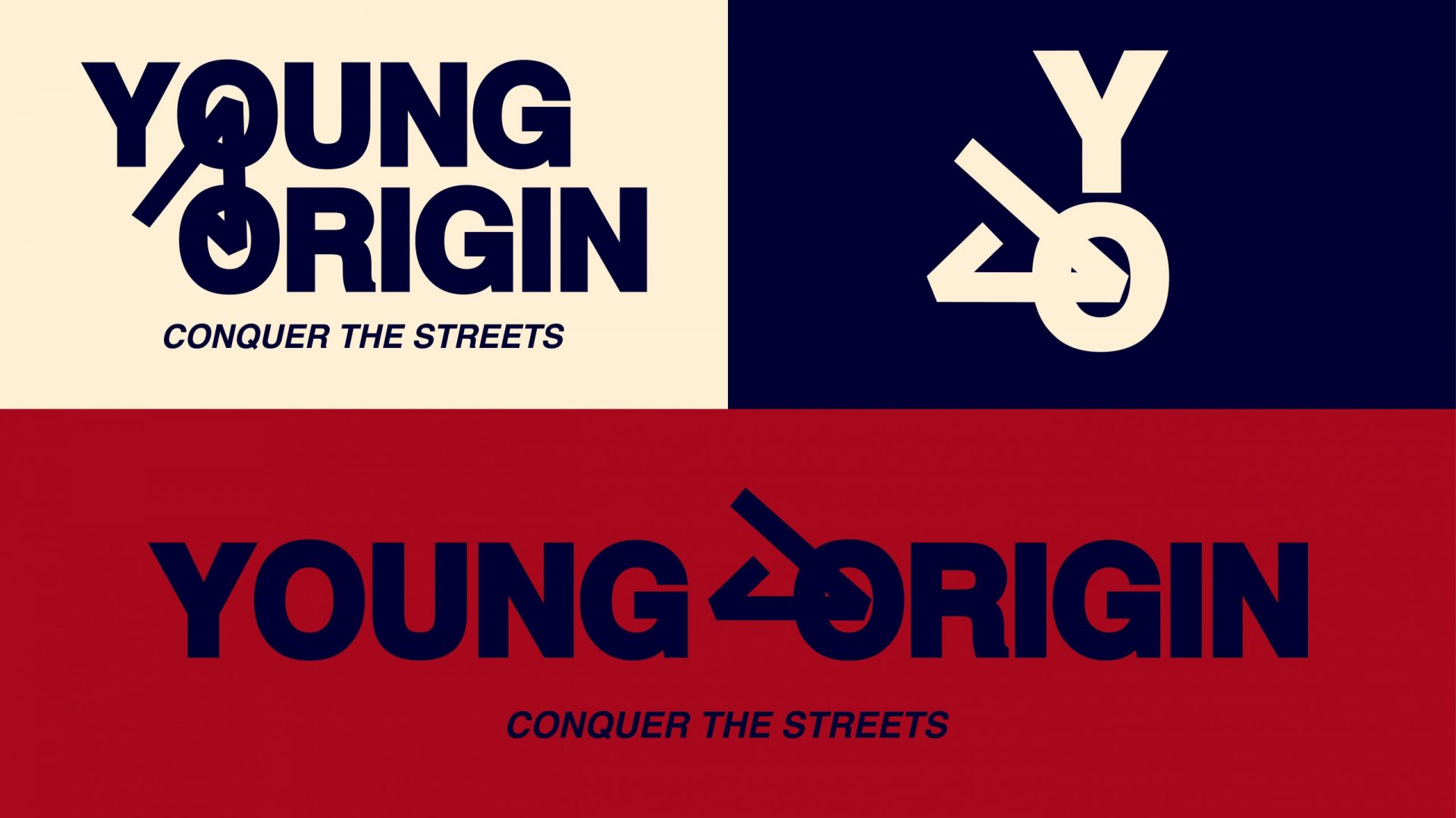
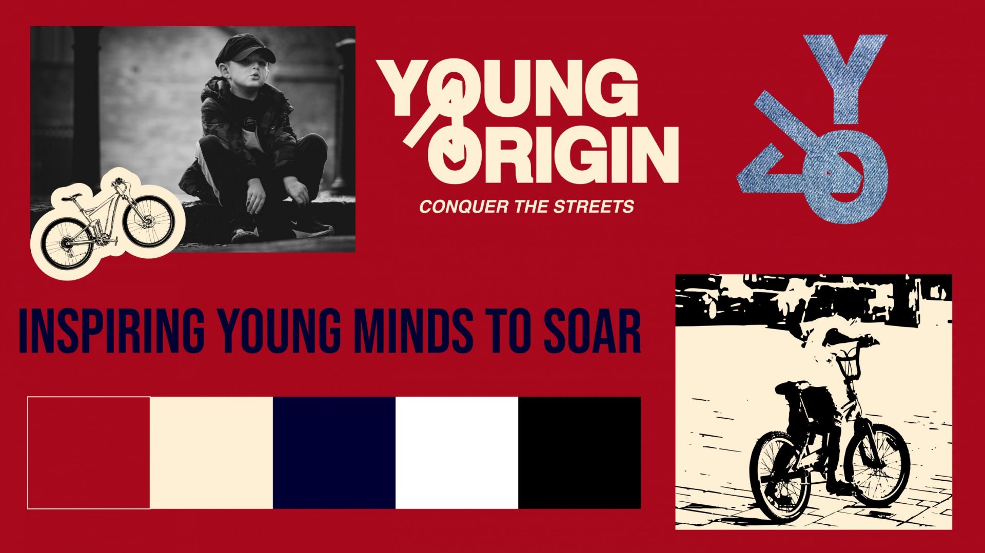
The logo is built around a single piece of typographic thinking. The Y and O of Young Origin are constructed to read as a bicycle, the Y becoming the frame and handlebars, the two Os becoming the wheels. It rewards a second look without demanding one. The YO monogram takes the same approach, reading as a clothing hanger. The product worked directly into the mark.
The palette of deep red, navy, cream and black draws from classic sportswear. Loud and unambiguous, it gives the brand the associations the target audience will recognise and respect.
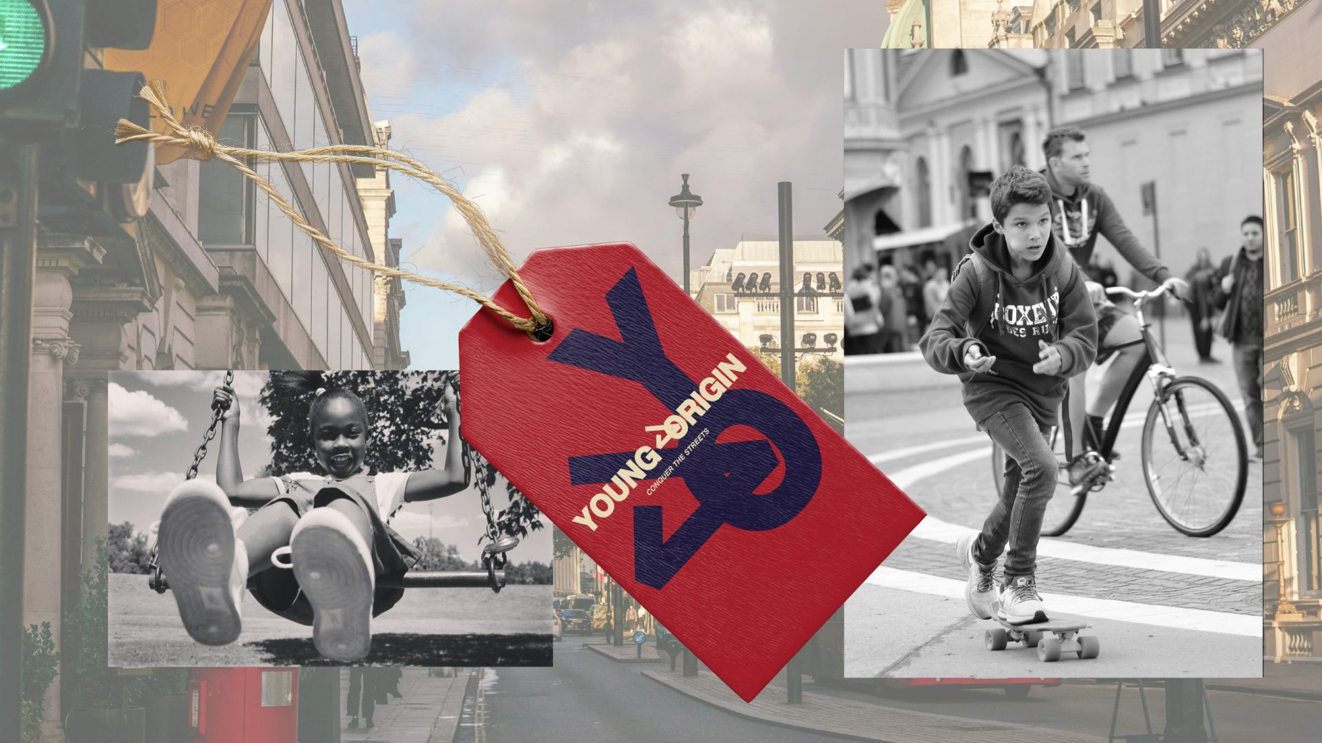
Photography is documentary in style. Black and white street images of kids skating, cycling and playing bring a younger audience into a category that typically skews older, without losing the urban edge that makes it worth wearing.
Young Origin has an identity sharp enough to stand on its own as a children’s streetwear label and honest enough to mean something to the children wearing it. In a market built on credibility, everything else is just clothing.
KPIs
Brand Awareness Growth
01
+
800
%
awareness in local area and online search
Brand Differentiation Score
02
+
700
%
increase in brand differentiation for distinctiveness in its industry category