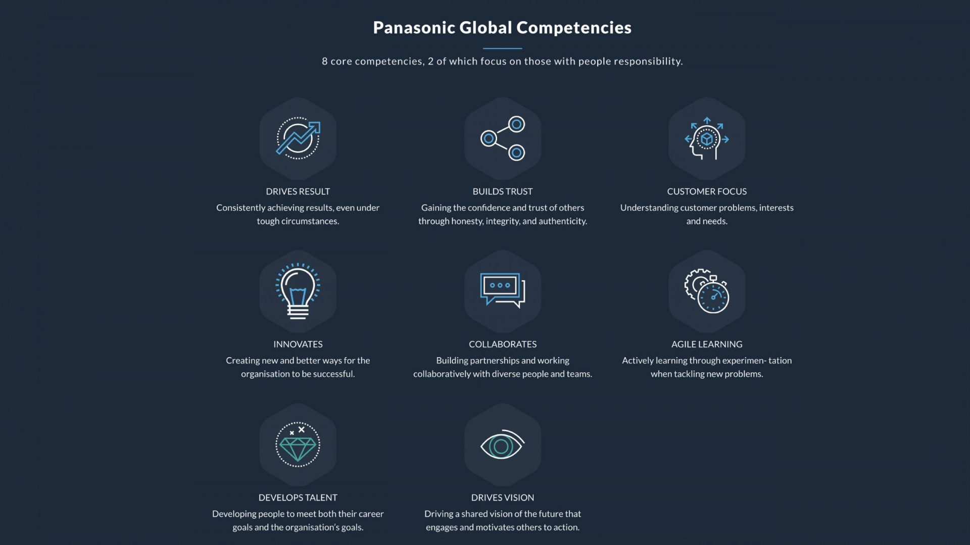
Panasonic operates across more than 100 countries with a workforce of over 230,000 people. Getting that many people aligned around the same standards of behaviour is not a communications problem. It is a design problem. The brief was to take eight Global Competencies and build an app that would be used in-house by all staff.
Competency frameworks fail the same way every time. They get written, formatted into a PDF, emailed out, and forgotten. The content is rarely the problem. Panasonic’s framework had substance, eight competencies each broken into tiered behavioural descriptors, but it lived in a format that worked against it. No visual system, no digital home, no reason for anyone to return to it.
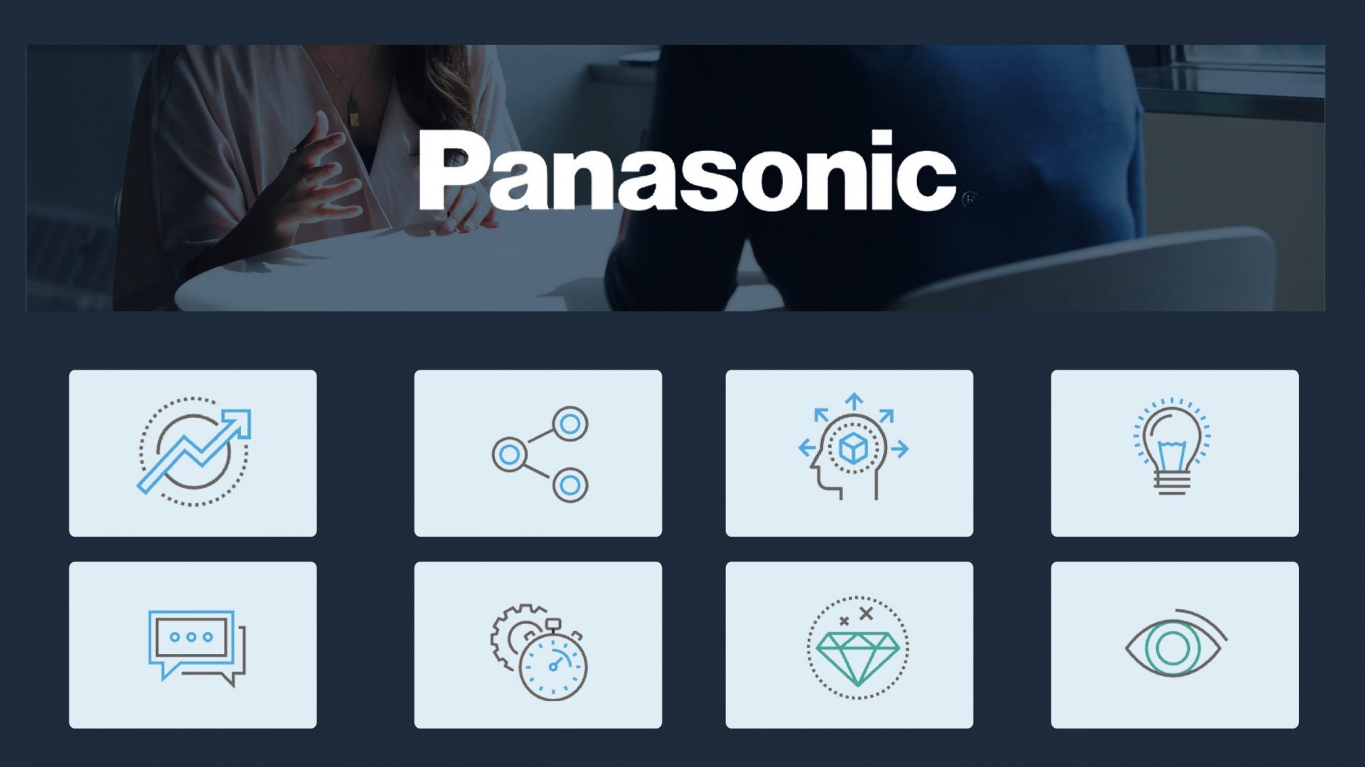
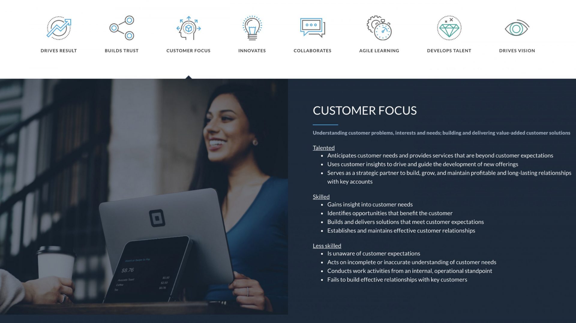
Each of the eight competencies got its own icon, built within a visual system that extended Panasonic’s existing brand rather than departing from it. Dark navy, blue and teal accents, a clean grid. Authoritative without being heavy.
The behavioural descriptors were structured across three levels, Talented, Skilled and Less Skilled, giving managers something concrete to work with in performance conversations rather than language they had to interpret first. Photography showed real workplace situations: one-to-ones, team sessions, presentations. The kind of contexts the framework was actually meant to support.
The whole thing launched as a responsive web platform, built to standards that would carry directly into a mobile app.
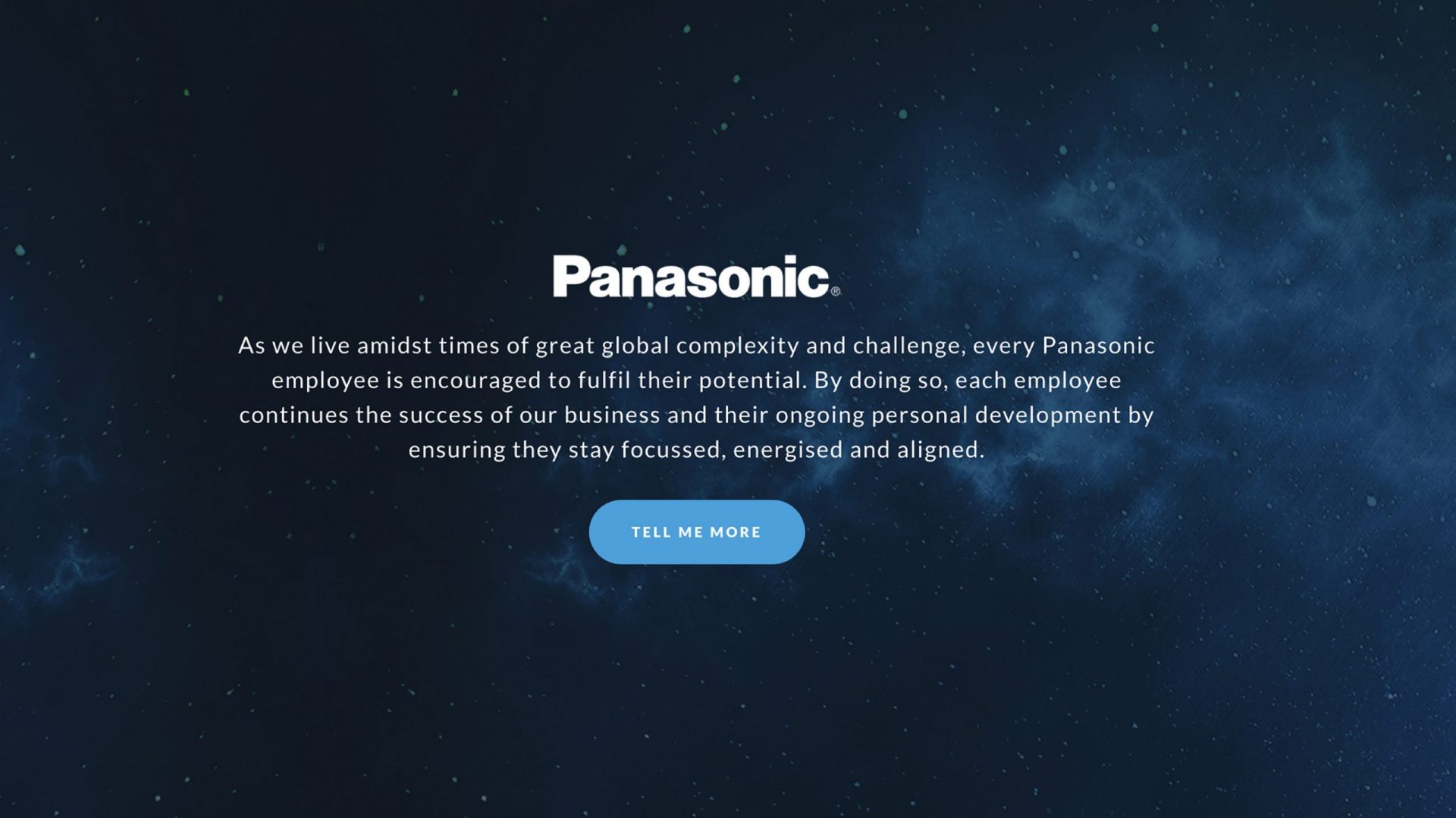
Panasonic already had a framework worth having, but the platform gave it somewhere to live and a reason to be used. The client moved straight into planning the mobile app, not because the brief required it, but because the foundation was solid enough to build on.