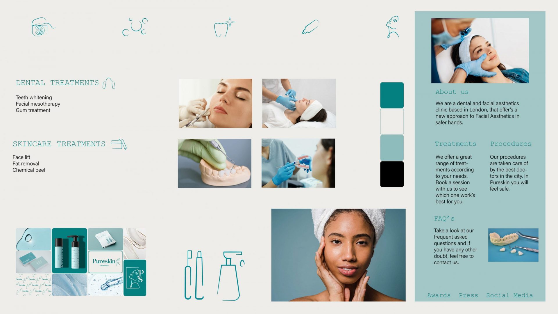
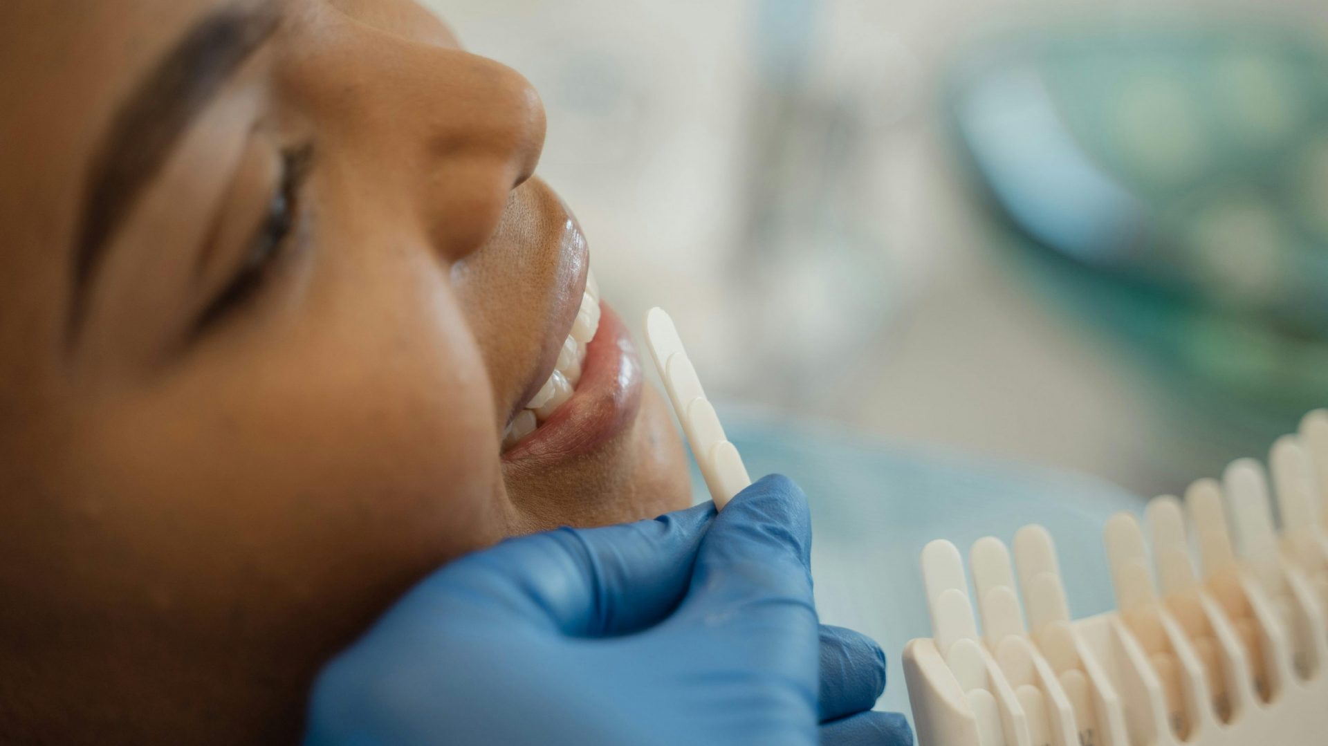
Pureskin is a London-based facial aesthetics clinic that combines dental and skincare treatments. Their services span teeth whitening and gum treatment through to chemical peels, fat removal, and facial mesotherapy. We created a full brand identity.
The facial aesthetics market sits at the crossroads of medicine and beauty, and most brands in the sector commit to one or the other. Facial aesthetics clinics on the medical end risk feeling cold, but those that present themselves as beauty brands can struggle to look credible enough for procedures that require real medical expertise. The goal was to communicate the credibility and expertise of a medical clinic without the visual language that these clinics tend to use.
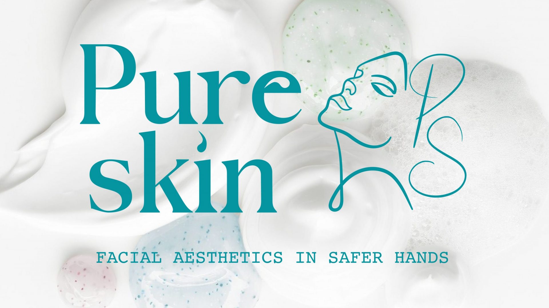
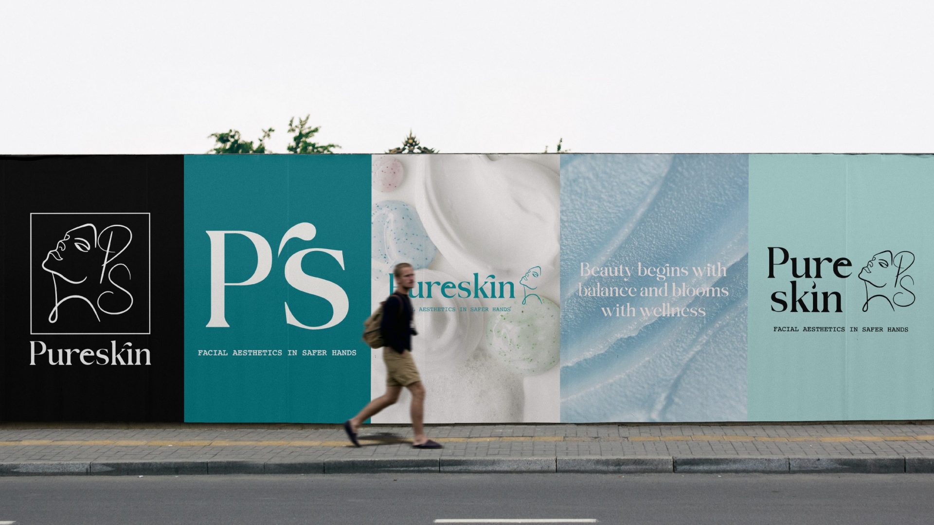
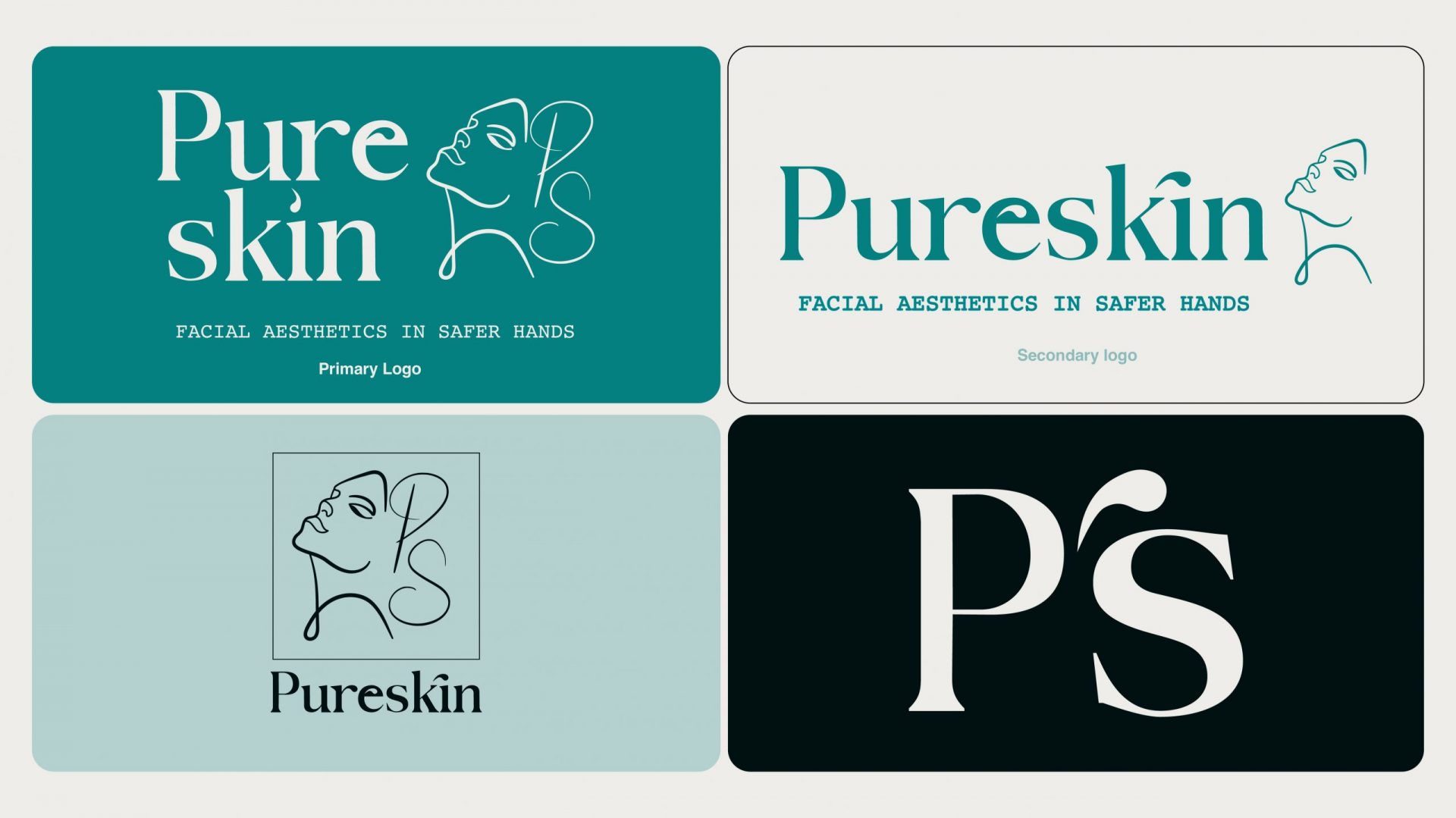
The wordmark is set in a high-contrast serif, with the dot over the “i” replaced by a water droplet. It ties the name to ideas of hydration and skin health, and gives the wordmark a character that most aesthetics brands don’t have.
The illustration is a continuous line drawing of a woman’s face and neck, with the PS monogram worked into the composition in a scripted font designed to read as flowing hair. Once you notice the letters, the illustration becomes harder to forget and easier to identify.
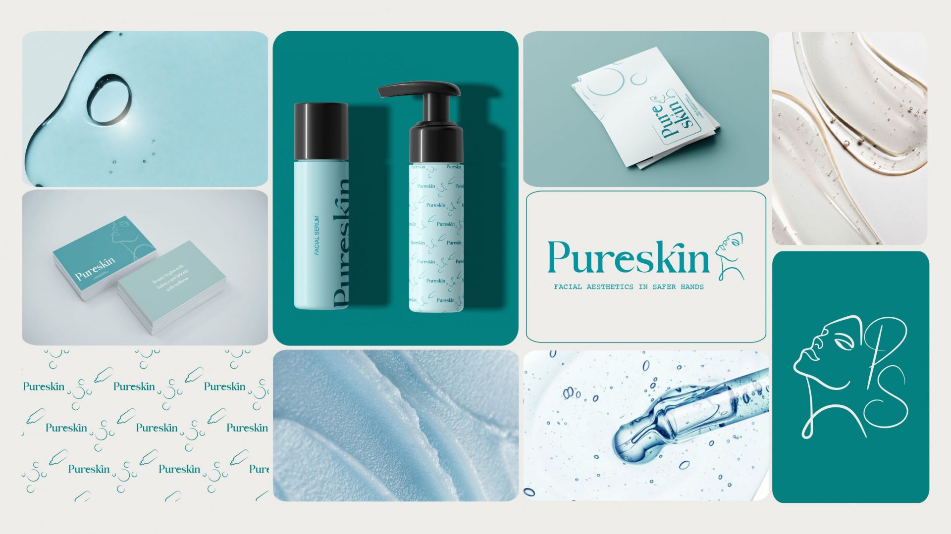
The palette is built around a deep teal primary, with pale mint, white, and black as supporting secondary colours. Teal is vivid and distinctive in a market where most competitors default to white and pale pink, and black gives the logo a sense of luxury when shown in monochrome.
Pureskin sits in a unique position in the facial aesthetics market — premium enough to compete with high-end beauty brands and credible enough to be taken seriously as a medical practice. The brand communicates the expertise of the clinical team and gives Pureskin a foothold in a niche that few competitors have managed to occupy.