WintaHill is an emerging music artist who needed a complete brand identity built from the ground up. The brief covered everything: logo, visual system, album artwork, and advertising materials. The work had to be credible to the music industry and authentic to the urban culture the artist comes from. Both audiences at once, with no concessions to either.
In the music industry, first impressions are formed before anyone presses play. For an established act, a weak visual identity is a missed opportunity. For an emerging artist, it is a closed door.
WintaHill needed an identity strong enough to earn credibility with curators, promoters, and labels, while remaining genuinely rooted in the urban culture he represents. Borrowed aesthetics or generic industry signifiers would have undermined both. The brand had to read as real from two directions simultaneously.
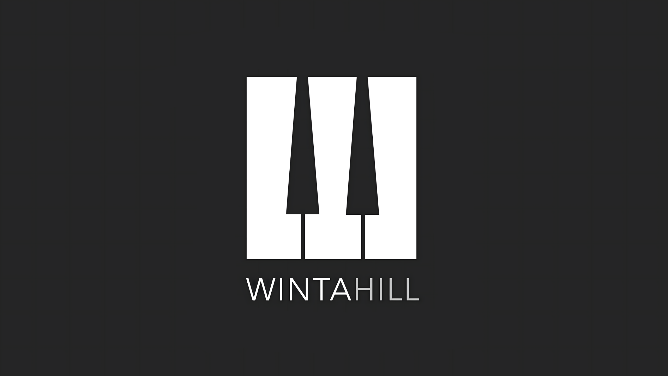
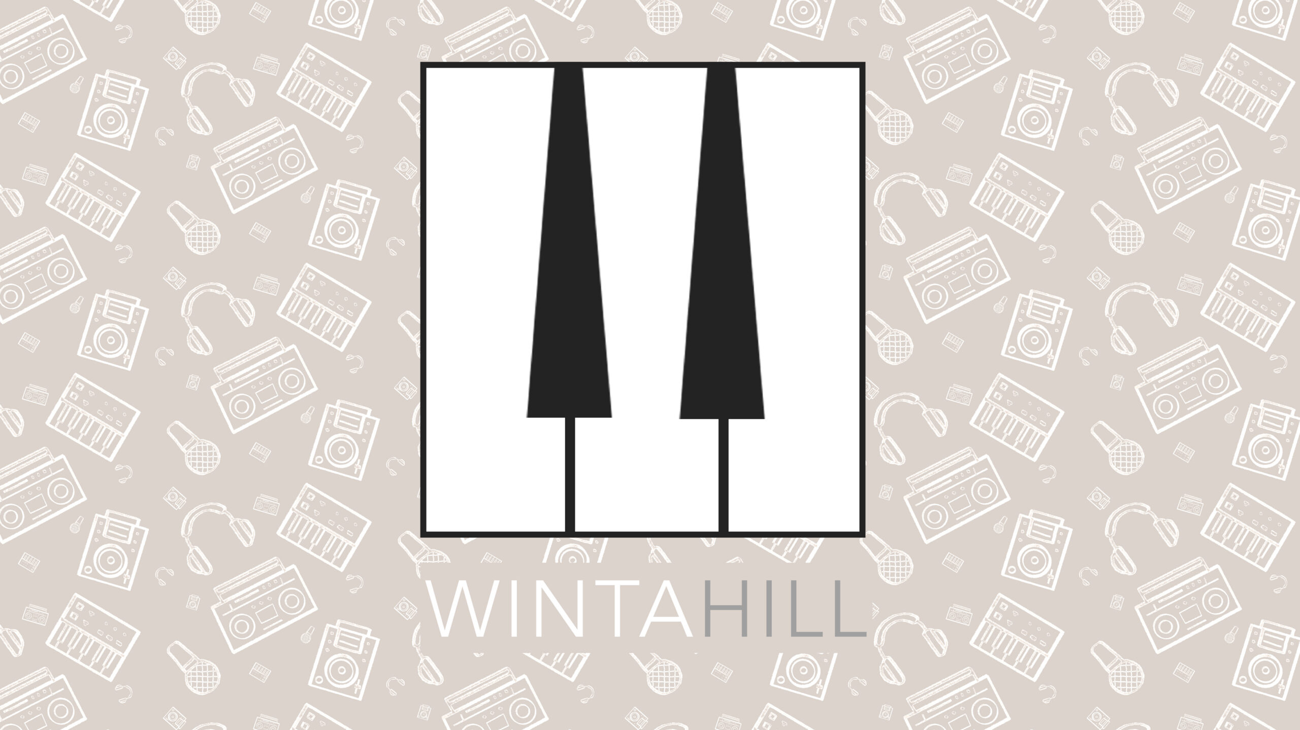
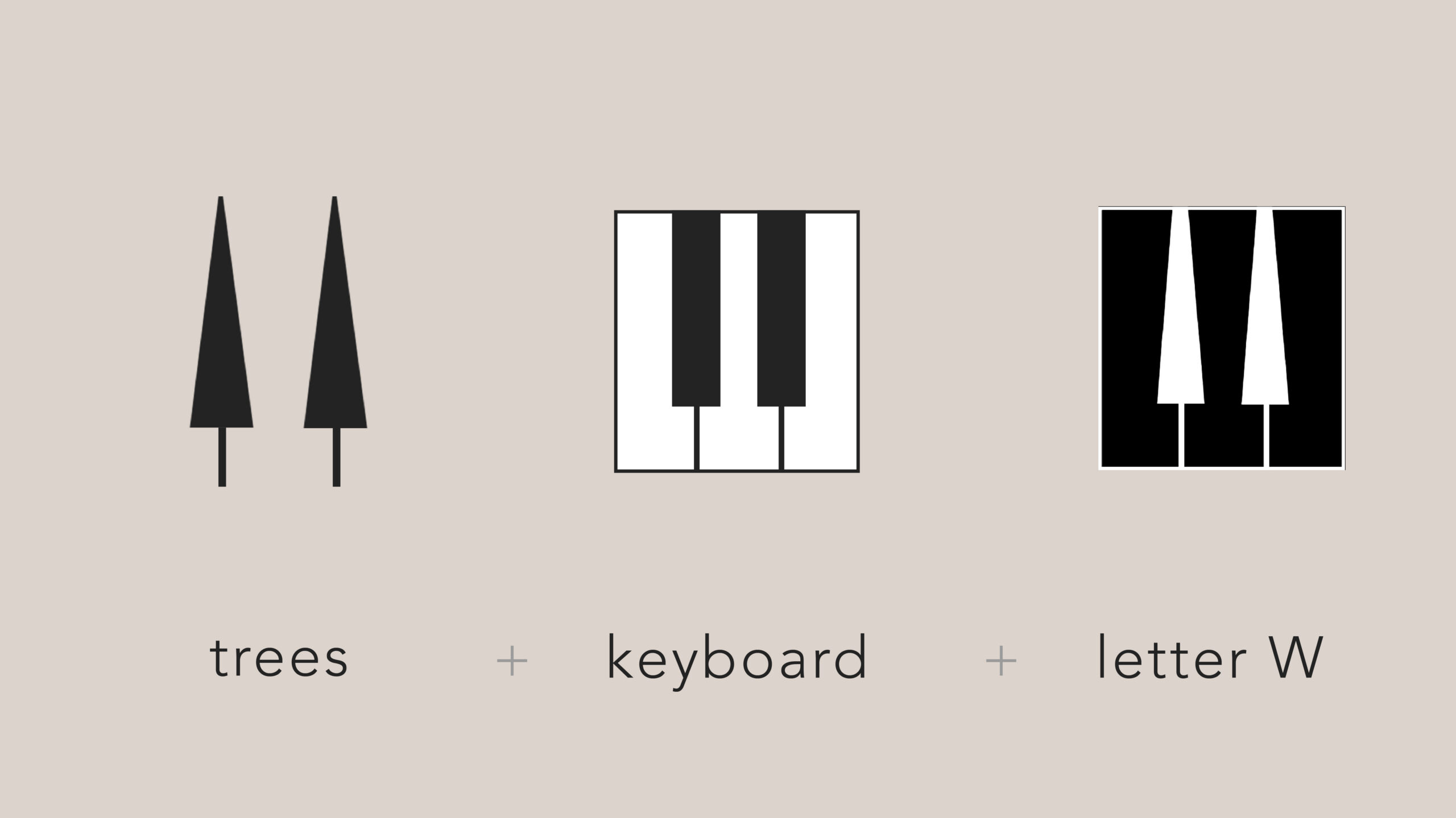
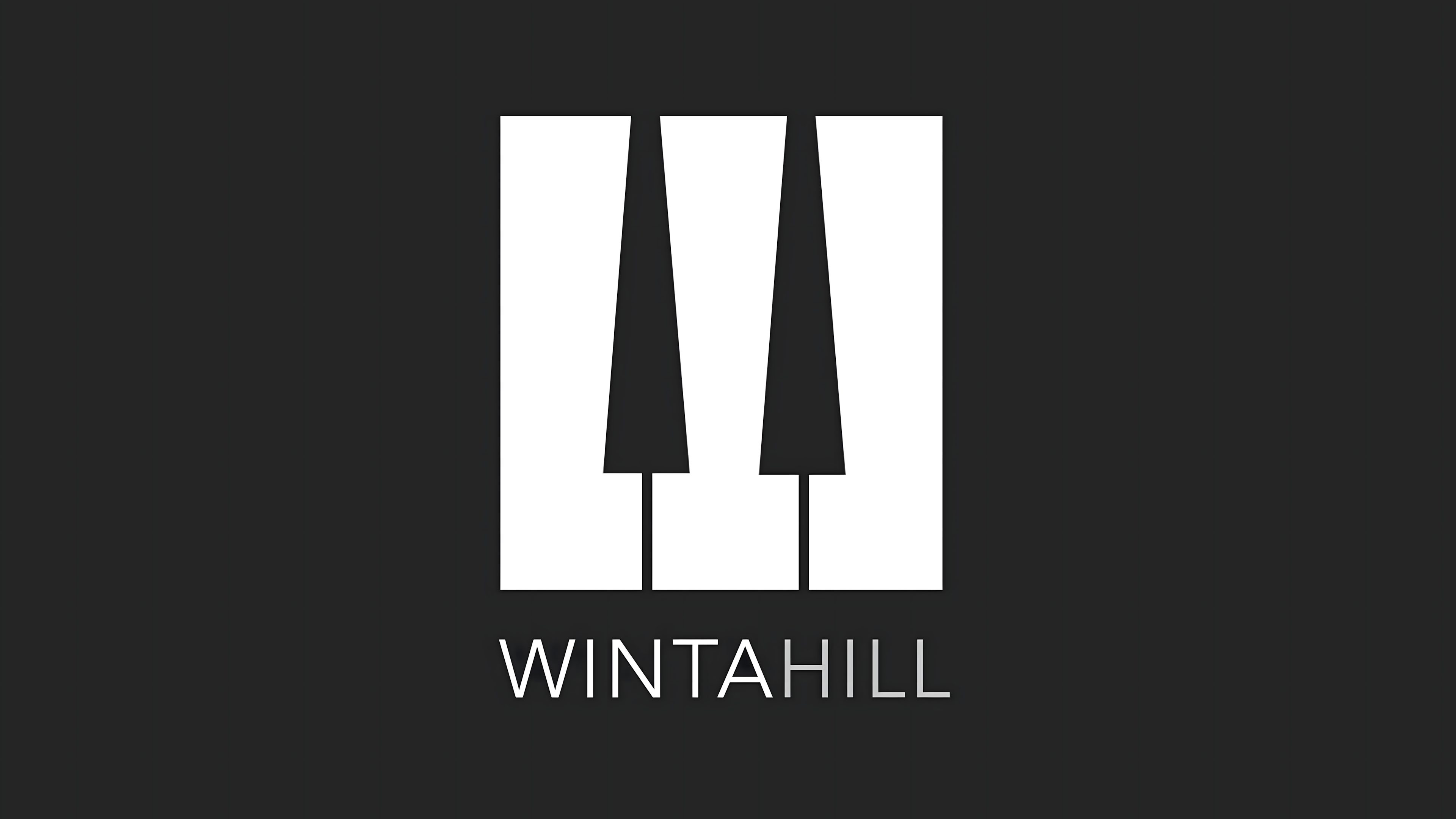
The logo compresses three distinct references into a single unified mark: the silhouette of two trees, the shape of a piano keyboard, and the letter W. Each element is individually legible, but the mark only works as a whole. That layering was deliberate. It rewards closer attention without requiring it.
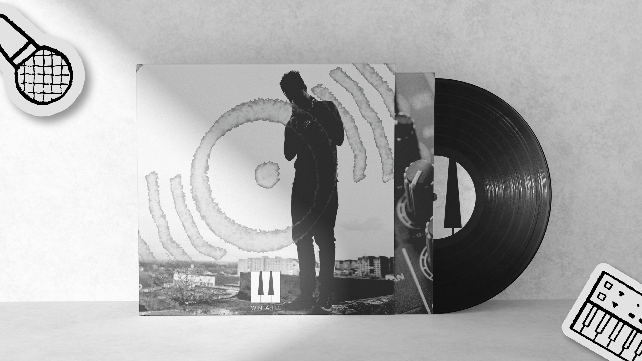
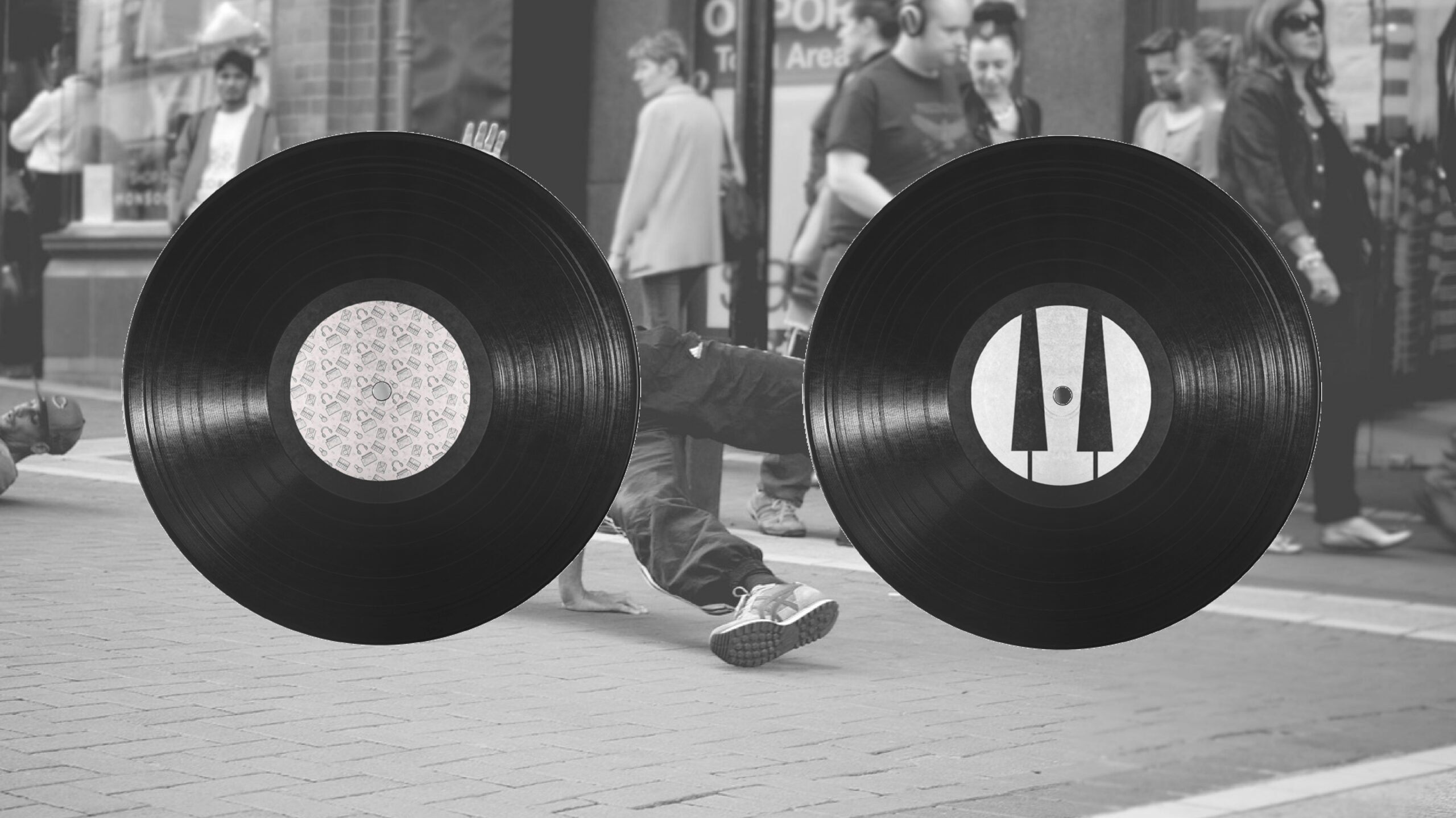
The primary palette is black and white: high contrast, immediate, built to stop someone at distance. A secondary palette of charcoal, off-white, and warm gold runs through supporting materials for contexts where the audience is already paying attention: album packaging, merchandise, print collateral.
The two palettes serve different moments in the same brand relationship. The primary gets the attention. The secondary holds it.
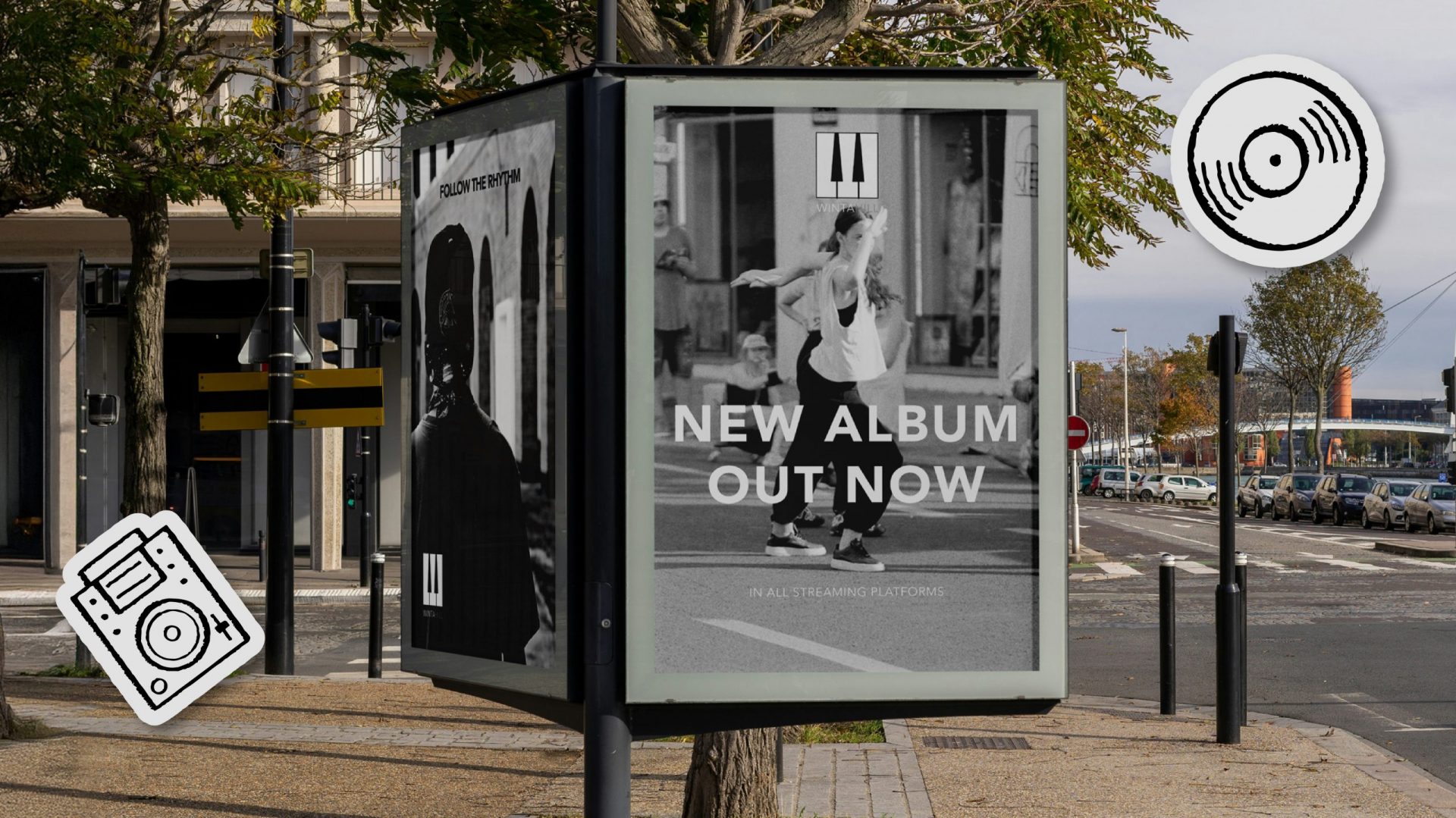
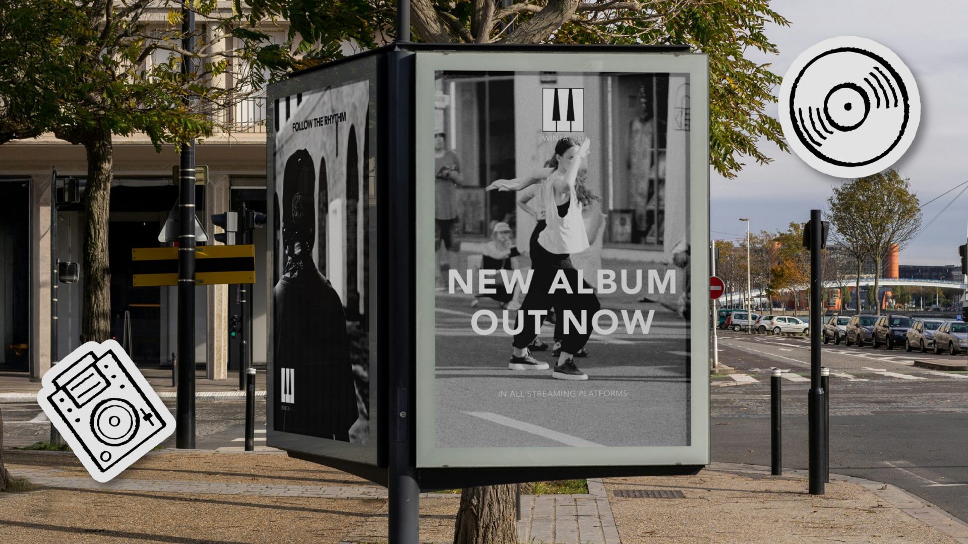
The mark scales without modification from vinyl label to billboard to album cover. No redraws, no simplified variants. Technically, that is a function of how the logo was constructed. In practice, it removes friction from every future application.
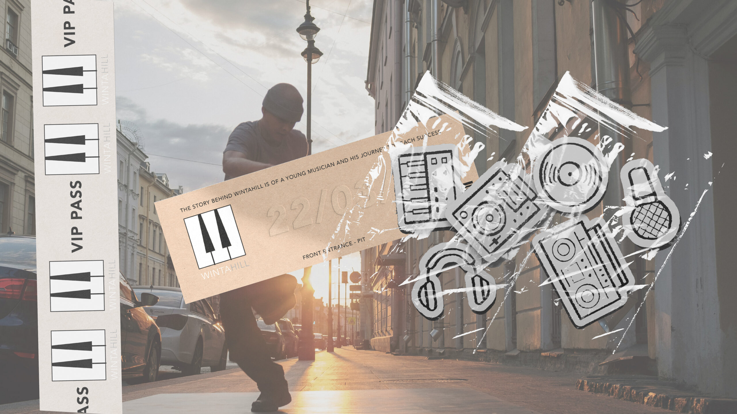
The more telling test is how the identity reads in photography. The mark does not look applied to the artist’s world. It looks like it belongs there. That is the difference between a logo and a brand. WintaHill has the latter.
KPIs
Digital-First
Delivery
01
800
%
digital campaigns leading to
400
%
less print and waste
Brand Differentiation Score
02
+
900
%
increase in brand differentiation in the music industry