GROW is a boutique rowing studio built for young professionals and city dwellers who want a high-end place to train. The brief was a complete brand build from scratch: identity, visual system, art direction, and website. The brand had to feel premium and considered while staying true to the physicality of the sport it is built around.
Boutique fitness is a crowded market. Studios compete on experience as much as equipment, and the brand is often the first thing a potential member encounters. For GROW, the identity needed to appeal to an urban, design-conscious audience while clearly communicating the discipline that rowing demands. Those are not opposing ideas, but they are easy to get wrong.
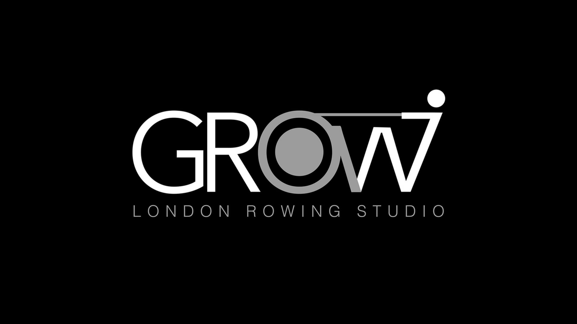
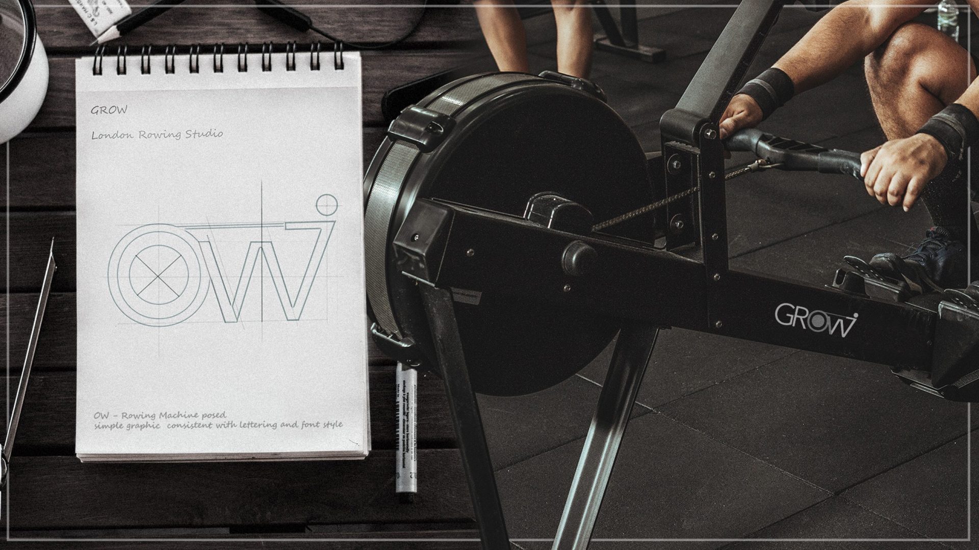
The brand values were simplicity, strength, and style. All three had to be present in the logo itself.
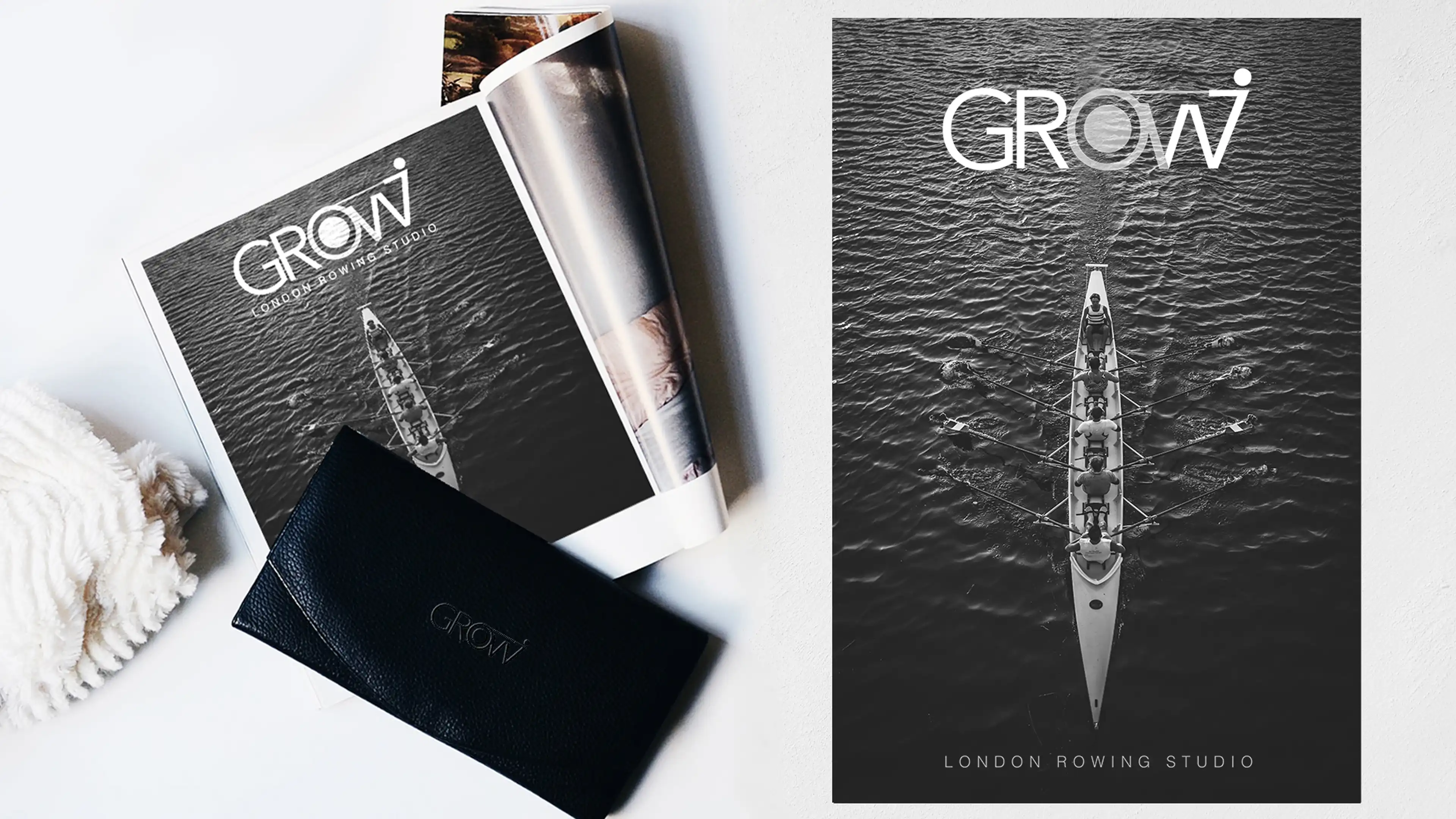
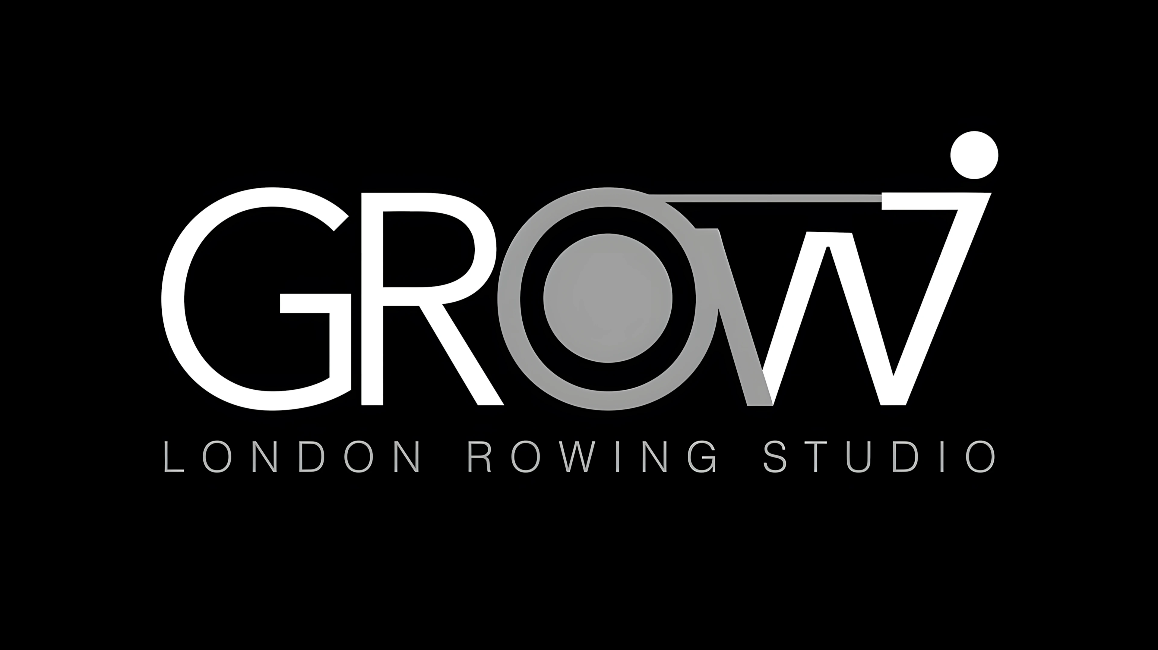
The logo is a custom wordmark where the letterforms carry the concept directly. The O references the flywheel of a rowing machine. The W echoes the motion of a rowing stroke. A single horizontal line connects both, representing the oar. The logo is typographic and illustrative at once, with no separate icon needed.
Early sketches show the construction being worked out geometrically: concentric circles for the O, a strict grid governing the proportions of the W. That precision is visible in the finished logo.
The colour system is black, white, and grey throughout. The restraint is intentional. It keeps the focus on form and gives the brand the flexibility to work across a wide range of surfaces without adjustment.
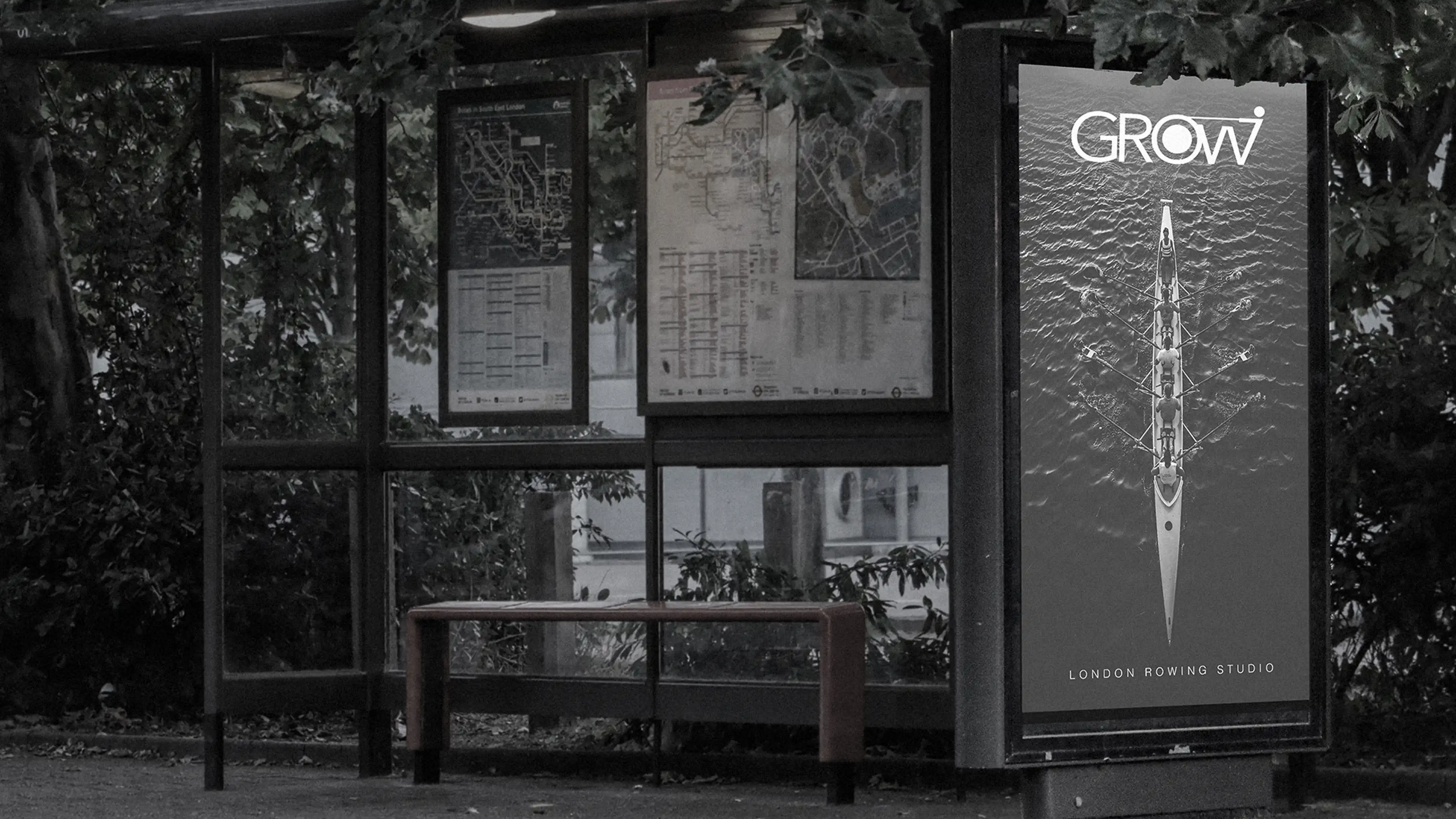
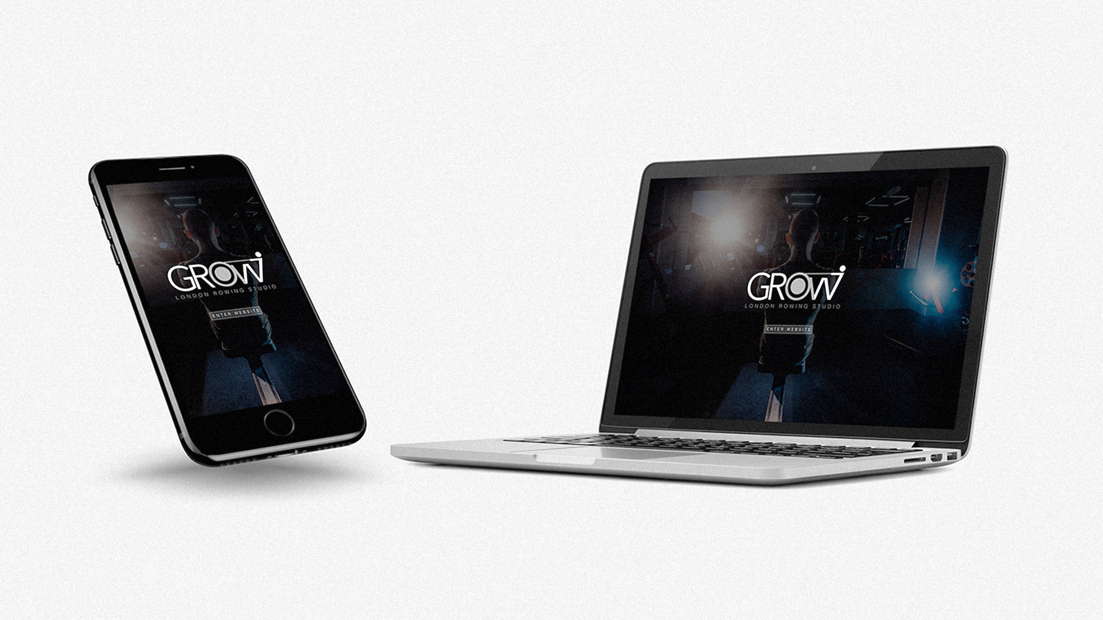
Art direction extended the same thinking. Advertising visuals use aerial rowing photography in high contrast monochrome. Print materials are clean and editorial. The website translates the identity to digital without losing anything in the process.
The brand appears across bus stop advertising, print collateral, branded studio equipment, and digital. It holds at every scale. The real measure is the studio itself: the logo on the rowing machine reads as part of the space, not something added to it. That is what a well-built fitness brand should do.
KPIs
Digital-First
Delivery
01
700
%
digital campaigns leading to
600
%
less print and waste
Brand
Differentiation
Score
02
+
500
%
increase in brand differentiation for distinctiveness in its industry category.