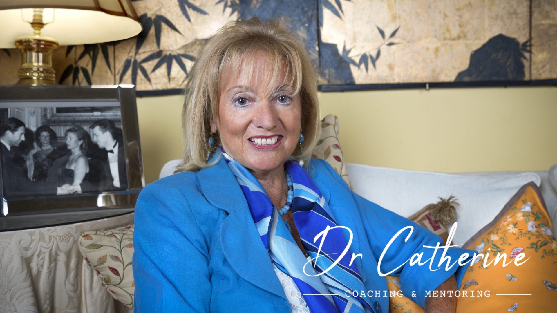
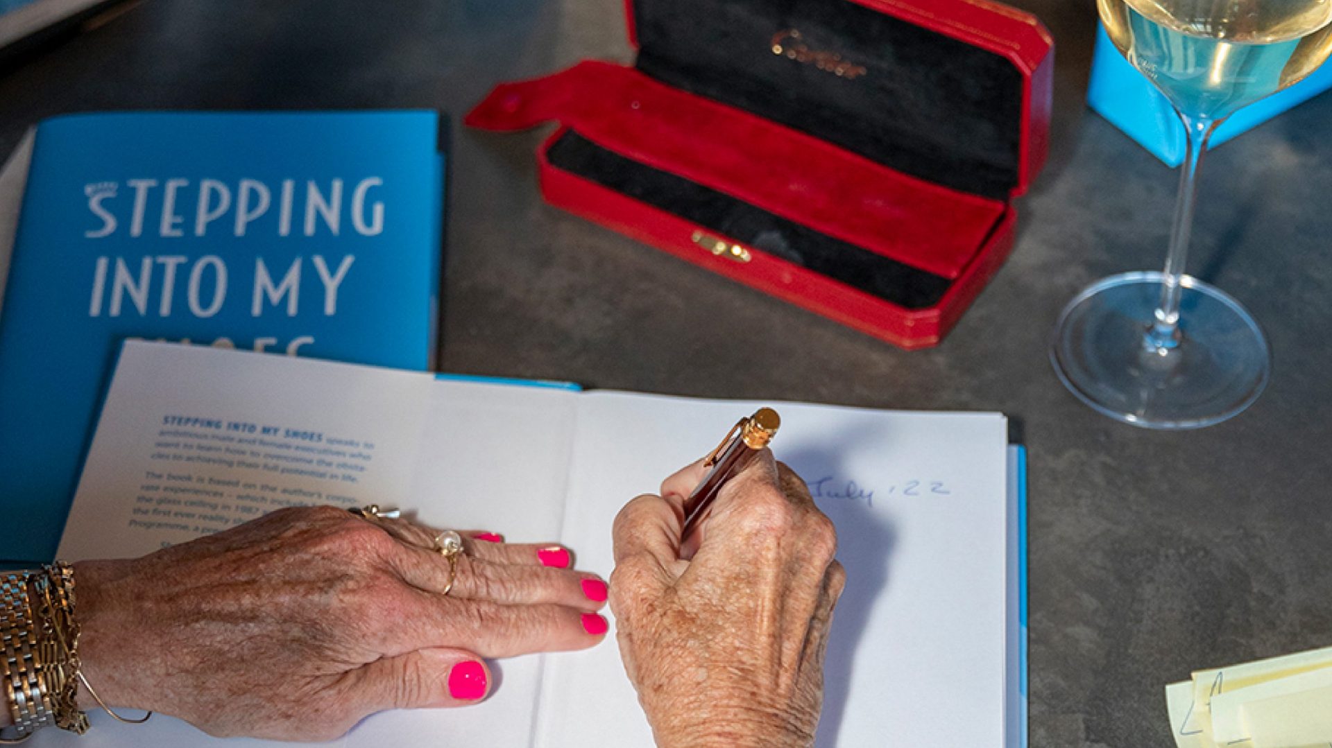
Dr Catherine Baudino is a coach, mentor, and author with a career that spans academia, senior corporate leadership, and executive coaching. She began in Comparative Literature before moving into the commercial world, where she broke the glass ceiling in 1987, becoming one of the few women at the time earning at that level. That combination of intellectual rigour and hard-won corporate experience is the foundation of her coaching practice. We created her full visual identity, website, and the cover and event materials for her debut book, Stepping Into My Shoes.
Dr Catherine’s background made this harder to resolve than usual. She had a PhD at 24 and had broken into senior corporate life by 1987, at a time when women were largely shut out of both. The identity needed to reflect someone whose authority came from living through the obstacles her clients are still navigating.
The brand also had to cover more ground than a typical personal brand. A coaching practice, a debut book, a speaking profile, and a growing media presence were all launching at once — each pulling the identity in a slightly different direction.
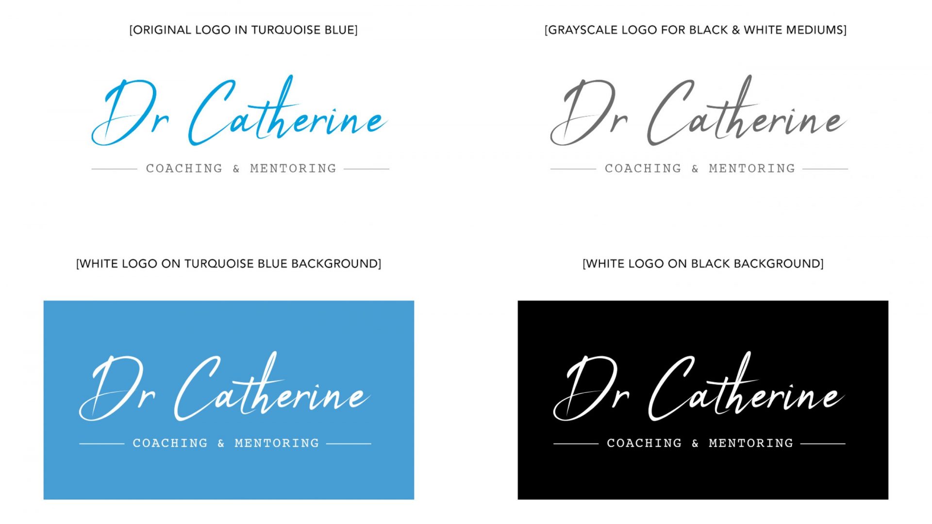
The logo uses her first name only, set in a flowing script. Using “Dr Catherine” rather than her full surname keeps the name short and positions her as someone you’d refer to by first name, the way you would a doctor or a mentor you trust. Below it, “COACHING & MENTORING” sits in spaced small caps, flanked by short horizontal rules. The two type styles separate her name from her service, giving the descriptor a quiet formality that the script above doesn’t carry.
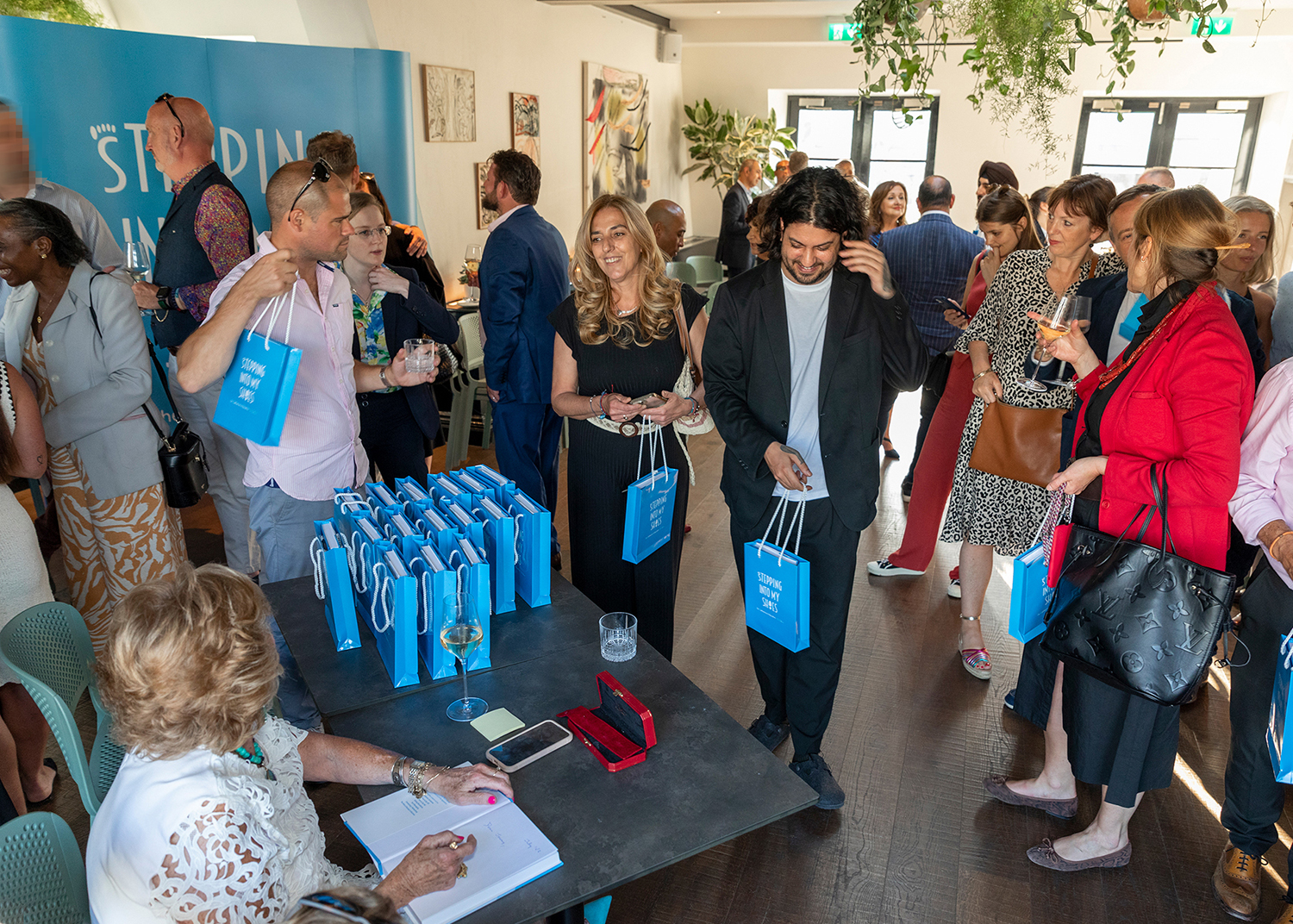
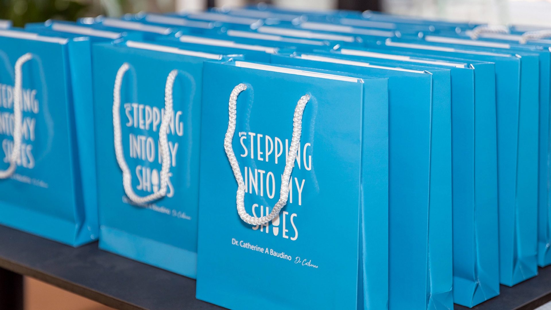
The palette runs from pale blues through to deep teal, with a neutral grey to add balance. The lighter shades appear in backgrounds and graphics to help keep those elements from taking focus from the content. A mid turquoise is used as the primary colour across marketing materials: the website, the event bags, and the logo. It is warm enough to feel personal but professional enough for a business context.
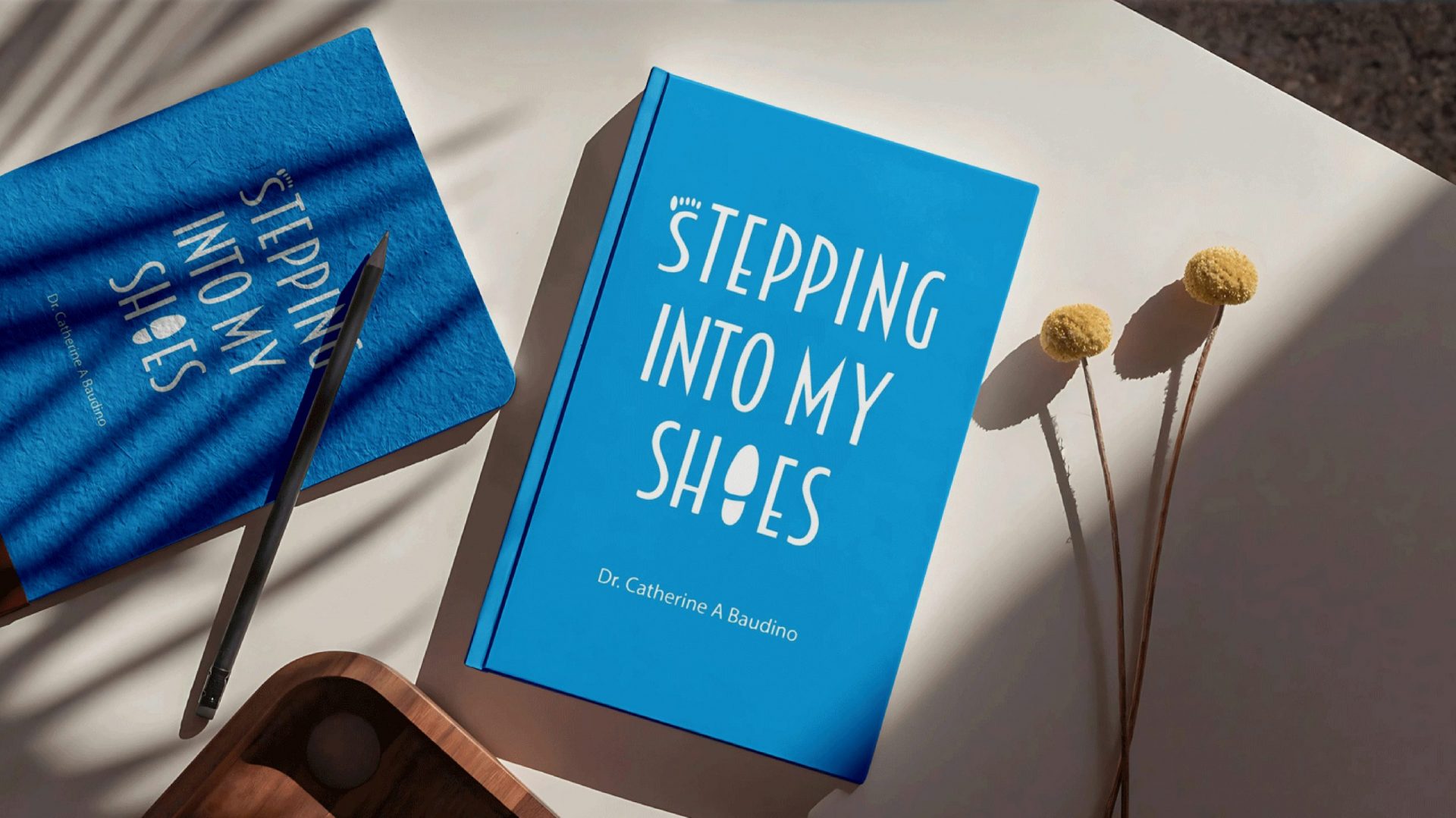
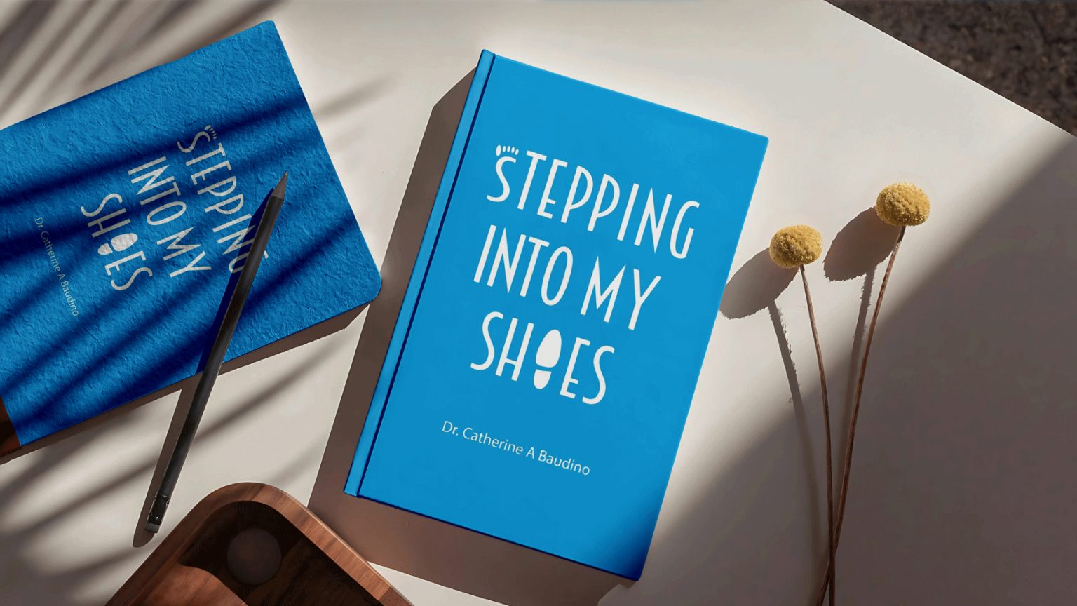
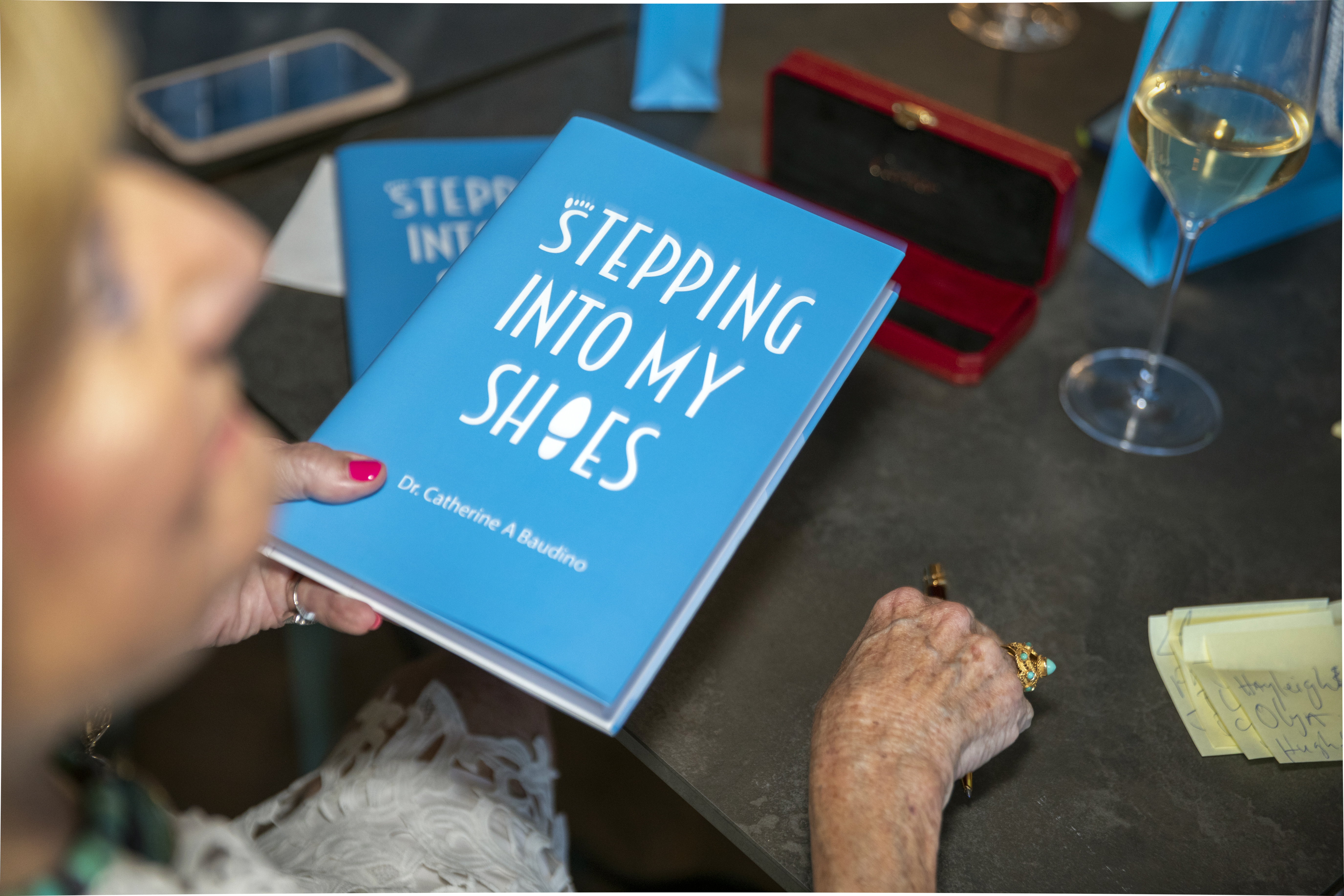
Bold white text stands cleanly against the turquoise background, and the “O” in “SHOES” is replaced by a shoeprint. As the only graphic element on the cover it turns the word into something you see rather than just read, making the title harder to forget.
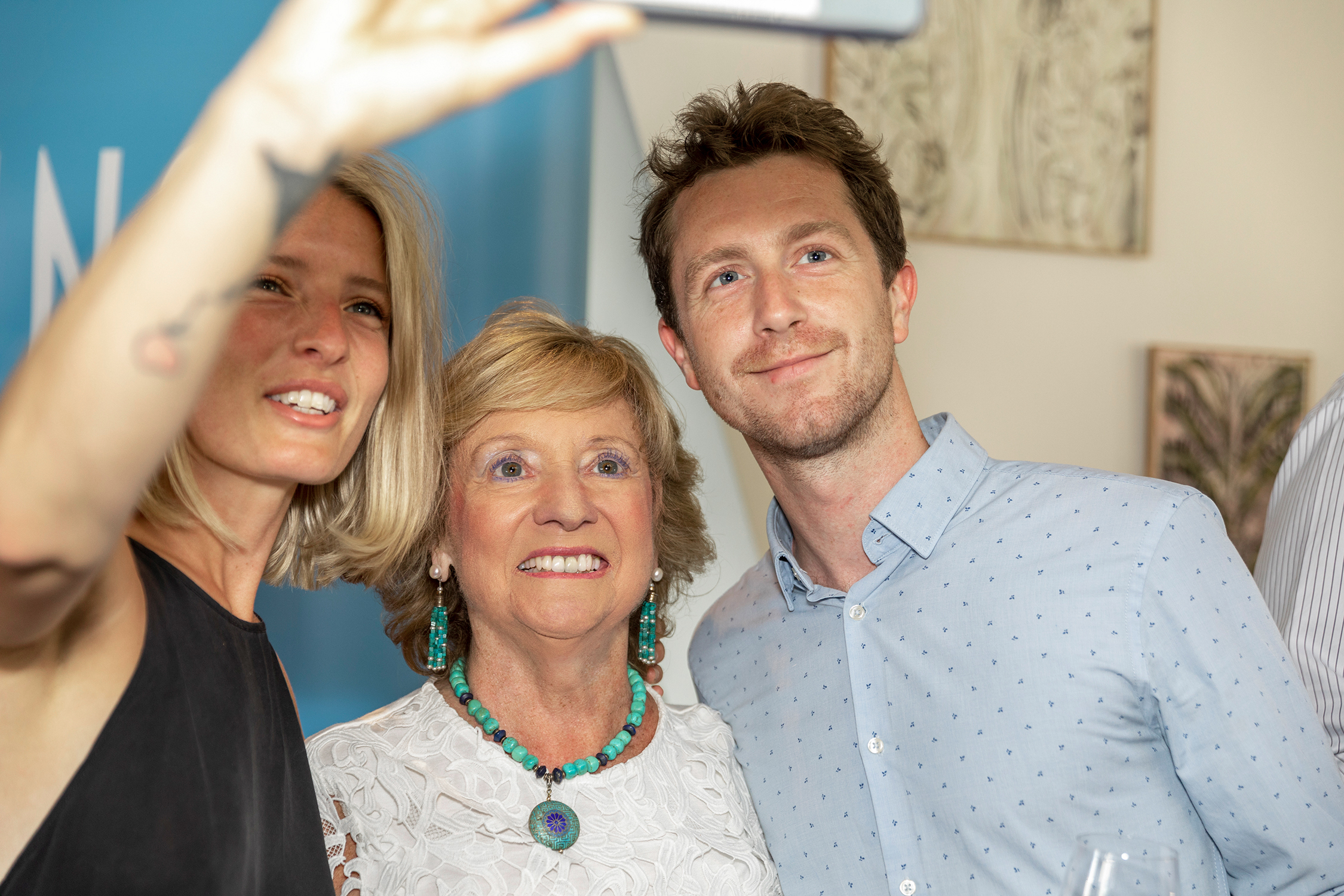
Dr Catherine launched Stepping Into My Shoes at the Allbright Club in London. The book was subsequently featured in We Are the City as a recommended read and shortlisted for the Business Book Awards. She has since built a public profile that spans executive coaching, speaking, and media.
KPIs
Website
Traffic
Growth
01
+
2200
%
traffic with
1500
k+
visitors annually nationwide
Media
Reach
Growth
02
+
1200
%
audience reach — top tier for distinctiveness in its category